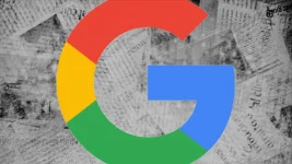
Google plans to change its famous G logo after ten years with the same design. The company will replace the current four-color G with a new rainbow version where colors blend. Users first noticed this update in the iPhone search app before it started appearing for Android phones. This fresh look might show how Google wants to highlight its artificial intelligence work. The rainbow design gives a more unified feel compared to the separate colors in the old logo.
The tech company has not said whether this change will happen across all its apps and websites. Google might wait until next year at its I/O 2025 event to explain the full plan for this new look. The updated logo creates a smoother visual that many people find appealing. This marks a shift from the design Google has used since 2015, when it last updated its brand image. Fans of the company seem happy about this colorful change as Google moves toward future projects.
The tech company has not said whether this change will happen across all its apps and websites. Google might wait until next year at its I/O 2025 event to explain the full plan for this new look. The updated logo creates a smoother visual that many people find appealing. This marks a shift from the design Google has used since 2015, when it last updated its brand image. Fans of the company seem happy about this colorful change as Google moves toward future projects.