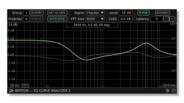
EQ Curve Analyzer’s group system can place two live analyses on the same graph, letting you compare separate plugin chains without exporting curves. The feature sounds minor until you try matching two EQs, checking alternate settings, or seeing whether an emulation’s controls behave like another processor.
Each measurement still needs a generator and analyzer pair. Groups keep those pairs separate, while Underlay lets one analyzer display the response from another group at the same time. Used carefully, the setup turns Bertom from a single-curve viewer into a practical A/B bench.
A simple comparison might put EQ A between two group 1 instances and EQ B between two group 2 instances. Match the sample rate, FFT order, display range, gain range, and any latency adjustment needed for each path. Comparing curves is much cleaner when the measuring conditions stay fixed.
Do not change several controls between captures and then stare at the graph looking for a single cause. Match the nominal frequency, gain, bandwidth, and mode first, then move one parameter at a time. Small differences become readable instead of turning into a knot of overlapping variables.
The method is especially useful with modeled analog EQs. Two plugins can label a control 60 Hz and still produce different center frequencies, widths, slopes, or interactions between boost and cut. The graph shows the response each control actually creates, not the promise printed beside the knob.
Keep the reference group untouched once you begin a serious match. Otherwise, the target keeps moving while you edit the second plugin, which makes visual matching surprisingly slippery. A stable reference turns every adjustment into a visible difference instead of a vague before-and-after memory.
One useful trick is to match broad shape before tiny details. Start with overall gain, center frequency, shelf level, and filter width. Only after those line up should you chase narrow deviations. Frequency-response comparison methods also recognize that point-by-point differences can miss the importance of shifted or similarly shaped features.
Phase deserves its own pass. Two magnitude curves can sit almost on top of each other while their phase responses differ because the plugins use different filter structures or latency. Confirm latency alignment before treating a phase mismatch as a design difference, especially near the top of the frequency range.
The comparison workflow also makes level offsets obvious. A processor that adds a small amount of broadband gain can look more dramatic during listening even when its tonal curve barely changes. Seeing the offset on the analyzer lets you separate simple gain from an actual frequency-dependent change.
Level-dependent processors need extra caution. Saturators, compressors, dynamic EQs, and analog-style models may not behave like fixed linear filters, because their response can change with input level or dynamics. EQ Curve Analyzer is excellent for showing the magnitude and phase response it measures under its test conditions, but one static overlay should not be stretched into a claim about every behavior inside the plugin.
Use Bertom’s EQ Curve Analyzer update as the common measurement environment rather than mixing screenshots from different releases or display settings. Version 2.1.0 changed curve rendering and grid behavior, so visual differences between old and new captures can come from the analyzer presentation rather than the processor.
Save the comparison by documenting the plugin versions and control values outside the graph if the result matters later. Bertom’s live underlay is excellent for immediate inspection, but a screenshot without settings can become useless a month later. A curve only earns its keep when you can reproduce the conditions that made it.
Each measurement still needs a generator and analyzer pair. Groups keep those pairs separate, while Underlay lets one analyzer display the response from another group at the same time. Used carefully, the setup turns Bertom from a single-curve viewer into a practical A/B bench.
Groups keep each measurement pair calibrated
Give the first plugin chain one group number and the second chain another. Instances sharing a group can link relevant analyzer parameters, which helps the generator and analyzer stay calibrated as a pair. Separate group numbers stop the two measurements from collapsing into one assignment.A simple comparison might put EQ A between two group 1 instances and EQ B between two group 2 instances. Match the sample rate, FFT order, display range, gain range, and any latency adjustment needed for each path. Comparing curves is much cleaner when the measuring conditions stay fixed.
Do not change several controls between captures and then stare at the graph looking for a single cause. Match the nominal frequency, gain, bandwidth, and mode first, then move one parameter at a time. Small differences become readable instead of turning into a knot of overlapping variables.
The method is especially useful with modeled analog EQs. Two plugins can label a control 60 Hz and still produce different center frequencies, widths, slopes, or interactions between boost and cut. The graph shows the response each control actually creates, not the promise printed beside the knob.
Underlay turns separate measurements into one comparison
Underlay tells an analyzer to display the current data from another group behind its own response. If group 2 is your active comparison view, setting its Underlay value to group 1 places both measurements on the same graph. You can then adjust one processor and watch the gap between the curves change in real time.Keep the reference group untouched once you begin a serious match. Otherwise, the target keeps moving while you edit the second plugin, which makes visual matching surprisingly slippery. A stable reference turns every adjustment into a visible difference instead of a vague before-and-after memory.
One useful trick is to match broad shape before tiny details. Start with overall gain, center frequency, shelf level, and filter width. Only after those line up should you chase narrow deviations. Frequency-response comparison methods also recognize that point-by-point differences can miss the importance of shifted or similarly shaped features.
Phase deserves its own pass. Two magnitude curves can sit almost on top of each other while their phase responses differ because the plugins use different filter structures or latency. Confirm latency alignment before treating a phase mismatch as a design difference, especially near the top of the frequency range.
The comparison workflow also makes level offsets obvious. A processor that adds a small amount of broadband gain can look more dramatic during listening even when its tonal curve barely changes. Seeing the offset on the analyzer lets you separate simple gain from an actual frequency-dependent change.
Fair comparisons require controlled settings
Start from states you can reproduce. Use the same sample rate, oversampling mode, channel configuration, and plugin quality setting whenever those options exist. Some processors change their response with sample rate or internal oversampling, so a beautiful overlay means little if the two measurements were made under different operating conditions.Level-dependent processors need extra caution. Saturators, compressors, dynamic EQs, and analog-style models may not behave like fixed linear filters, because their response can change with input level or dynamics. EQ Curve Analyzer is excellent for showing the magnitude and phase response it measures under its test conditions, but one static overlay should not be stretched into a claim about every behavior inside the plugin.
Use Bertom’s EQ Curve Analyzer update as the common measurement environment rather than mixing screenshots from different releases or display settings. Version 2.1.0 changed curve rendering and grid behavior, so visual differences between old and new captures can come from the analyzer presentation rather than the processor.
Save the comparison by documenting the plugin versions and control values outside the graph if the result matters later. Bertom’s live underlay is excellent for immediate inspection, but a screenshot without settings can become useless a month later. A curve only earns its keep when you can reproduce the conditions that made it.