Bertom EQ Curve Analyzer measures both magnitude and phase response by comparing a generated test signal before and after a processor. The graph looks simple, but the two traces answer different questions, and reading them together prevents some very ordinary mistakes.
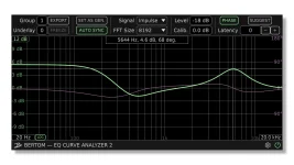
Start with magnitude. It shows how much the level changes at each frequency, so a flat line means the processor is not changing level across the displayed range. A rise marks gain, a dip marks attenuation, and a sloping edge shows a filter progressively removing or adding energy as frequency changes.
Phase needs more care because timing enters the picture. A processor can produce a believable magnitude curve while the phase display looks wild if the two analyzer instances are not properly synchronized. The EQ Curve Analyzer 2.1.0 update changed rendering and grid behavior, so old screenshots can differ even when your measurement is sound.
Do not obsess over one pixel of curve height. The useful comparison is between the measured shape and the control setting you intended to test. If an EQ says it is adding a broad 3 dB lift, check the center, width, and general gain first; tiny edge differences can wait.
Filter shape often tells you more than the number printed on a knob. Two EQs set to the same nominal frequency can bend differently because their bandwidth, slope, topology, or control calibration differs. Run one change at a time when learning a plugin, because several active bands can overlap and make a normal response harder to decode.
A flat magnitude response also deserves restraint. It only tells you the level is unchanged across frequency under the conditions being measured. It does not prove every part of a processor is inactive, so treat the curve as one measurement, not a verdict on the whole plugin.
A repeating diagonal or sawtooth-like phase pattern is different. Bertom’s own guidance identifies this appearance as the frequency-domain signature of delay, which means latency compensation should be checked before you interpret the processor. Increase the latency adjustment until the delay pattern is removed and the remaining phase behavior becomes stable enough to read.
Precision matters more here than many users expect. One sample of timing error corresponds to a 180-degree phase shift at the Nyquist frequency. Being merely close can leave the upper phase graph misleading because small timing errors produce larger phase angles as frequency rises.
Phase displays also wrap when the plotted angle crosses their display boundary. A vertical jump can be a wrapped continuation of the same trend, so read the slope around it rather than the jump itself. The phase slope carries timing information through the relationship between phase and group delay.
For a steady EQ curve, extra frequency resolution is useful in the low end because closely spaced points make filter shapes easier to inspect. A lower setting can react faster when parameters are moving, but the frequency picture becomes coarser. Pick the setting for the behavior you are trying to see instead of treating the maximum as a quality switch.
Keep the test simple when a curve looks suspicious. Bypass the processor, confirm the baseline is flat and the phase is properly aligned, then enable one filter or stage and watch what changes. If the bypassed measurement already shows unexpected tilt or a strong phase ramp, fix the measurement path before concluding the plugin.
Small controlled moves make the graph much easier to read. Change one frequency, gain, slope, or mode at a time and watch which part of the response follows it. Once the connection between a control and its trace is obvious, complicated curves become easier to parse and use as measurements.
Start with magnitude. It shows how much the level changes at each frequency, so a flat line means the processor is not changing level across the displayed range. A rise marks gain, a dip marks attenuation, and a sloping edge shows a filter progressively removing or adding energy as frequency changes.
Phase needs more care because timing enters the picture. A processor can produce a believable magnitude curve while the phase display looks wild if the two analyzer instances are not properly synchronized. The EQ Curve Analyzer 2.1.0 update changed rendering and grid behavior, so old screenshots can differ even when your measurement is sound.
Magnitude shows how the processor changes by frequency
Read the magnitude trace from left to right as frequency and vertically as gain or loss. A bell boost should form a hump around its center frequency, while a cut should sink below the neutral line. Shelves settle at a different level after their transition, while high-pass and low-pass filters keep falling deeper into the rejected range.Do not obsess over one pixel of curve height. The useful comparison is between the measured shape and the control setting you intended to test. If an EQ says it is adding a broad 3 dB lift, check the center, width, and general gain first; tiny edge differences can wait.
Filter shape often tells you more than the number printed on a knob. Two EQs set to the same nominal frequency can bend differently because their bandwidth, slope, topology, or control calibration differs. Run one change at a time when learning a plugin, because several active bands can overlap and make a normal response harder to decode.
A flat magnitude response also deserves restraint. It only tells you the level is unchanged across frequency under the conditions being measured. It does not prove every part of a processor is inactive, so treat the curve as one measurement, not a verdict on the whole plugin.
Phase becomes useful after latency is aligned
The phase trace describes frequency-dependent timing relationships, not a second version of the magnitude curve. Ordinary minimum-phase filters move phase around their transition regions, so bends near a cutoff or EQ band can be expected. The exact shape depends on the filter design and settings.A repeating diagonal or sawtooth-like phase pattern is different. Bertom’s own guidance identifies this appearance as the frequency-domain signature of delay, which means latency compensation should be checked before you interpret the processor. Increase the latency adjustment until the delay pattern is removed and the remaining phase behavior becomes stable enough to read.
Precision matters more here than many users expect. One sample of timing error corresponds to a 180-degree phase shift at the Nyquist frequency. Being merely close can leave the upper phase graph misleading because small timing errors produce larger phase angles as frequency rises.
Phase displays also wrap when the plotted angle crosses their display boundary. A vertical jump can be a wrapped continuation of the same trend, so read the slope around it rather than the jump itself. The phase slope carries timing information through the relationship between phase and group delay.
Resolution changes how much detail you can trust
EQ Curve Analyzer’s resolution control reflects a basic Fourier-analysis trade-off. Higher analysis order gives finer frequency resolution, while lower order improves temporal resolution. Neither position is automatically more accurate for every job.For a steady EQ curve, extra frequency resolution is useful in the low end because closely spaced points make filter shapes easier to inspect. A lower setting can react faster when parameters are moving, but the frequency picture becomes coarser. Pick the setting for the behavior you are trying to see instead of treating the maximum as a quality switch.
Keep the test simple when a curve looks suspicious. Bypass the processor, confirm the baseline is flat and the phase is properly aligned, then enable one filter or stage and watch what changes. If the bypassed measurement already shows unexpected tilt or a strong phase ramp, fix the measurement path before concluding the plugin.
Small controlled moves make the graph much easier to read. Change one frequency, gain, slope, or mode at a time and watch which part of the response follows it. Once the connection between a control and its trace is obvious, complicated curves become easier to parse and use as measurements.